D.K. Trinks & Co. Handmade postcards
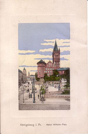
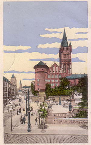
A color postcard published by the Leipzig publishing house "D.K. Trinks & Co." (Deutscher Kunstverlag Trinks & Co.), which existed in Germany for quite a long time - from 1907 to the early 1950s. At first glance, the postcard with a completely ordinary plot - Königsberg, Kaiser-Wilhelm-Platz and the Royal Castle - there is nothing interesting about it. But this is not entirely true. Let's take a closer look.
Firstly (but not the most important thing), the postcard has embossing (stamping) around the perimeter of the image. The stamping is not very noticeable on the front side, but is quite clearly visible on the back .
Secondly (and this is the most interesting part), the publisher used two processes when printing the postcard - machine and hand. The image itself was printed using the color phototype process . The main colors (red, yellow, blue) were applied by machine on an offset press. But the sky (look how unusual it looks) was painted by hand, using a stencil.
It would seem that hand painting should increase the cost of a postcard in comparison with a fully mechanized process. But an experienced "stencil artist", who had gained experience in similar operations, was able to paint a significant number of postcards per shift. The main problem was not the speed of painting a postcard, but the rather long time required for the hand-applied paint to dry completely.
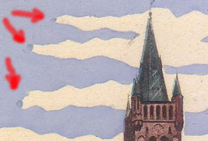
In some places the sky “overlaps” the main image, which, of course, could not happen with fully automated printing.

And now the answer to the obvious question "why was it necessary to color the sky by hand?" Yes, so that the postcards would stand out from the competitors' products. At all times, there are people who do not want to buy mass-produced goods. And here the postcards of "Trinks & Co." with their "trick" in the form of an opaque sky of a very unusual shade, clearly stood out among others. Although, in fairness, it should be said that "coloring" postcards were produced by more than one or even two publishing houses (for example, postcards were colored by hand in one of the largest German publishing houses Stengel & Co. ). At the same time, each of them tried to find something of its own, something special. It's just that not everyone succeeded in it as well as "Trinks & Co."
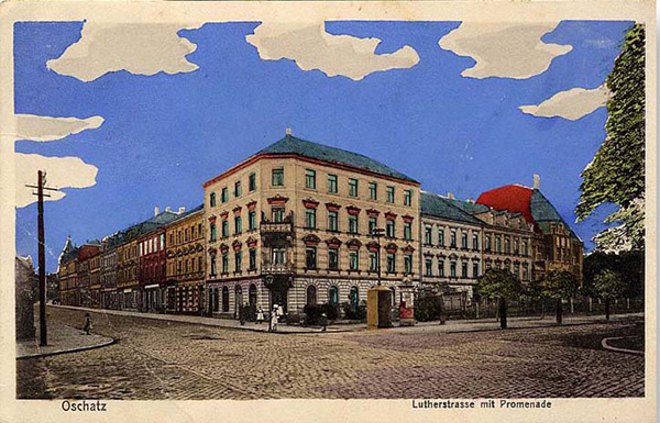
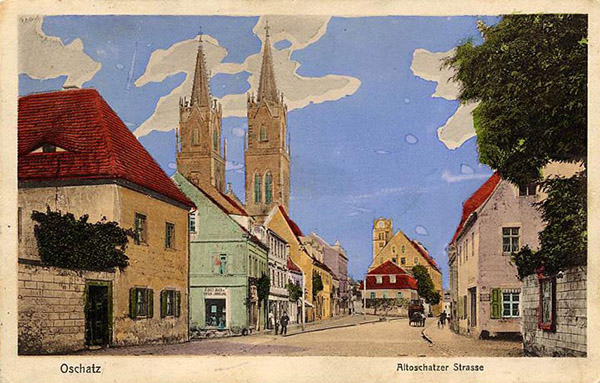
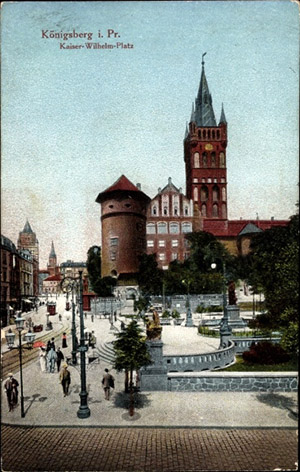
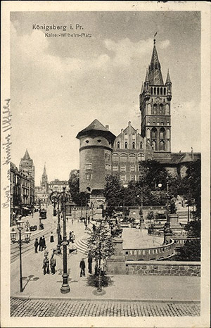
Below are a couple of examples of postcards with literally identical plots (the publishers are not indicated on these postcards), printed entirely by machine:
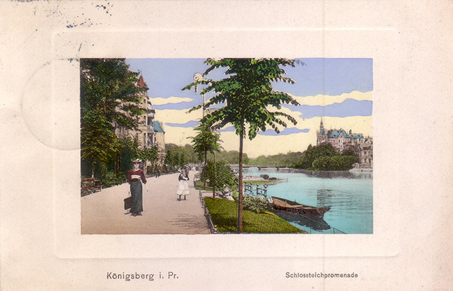
And now handmade postcards from Trinks & Co with hand-painted skies (as they say, feel the difference!):