Artistic postcards of Wehlau
Such beauties are few and far between! At least when it comes to the views of small towns and settlements in East Prussia.
The worldwide boom in postcard publishing in the late 19th and early 20th centuries did not bypass Wehlau (now Znamensk). Famous and unknown photographers from the region, and a good dozen Wehlau publishers preserved images of the old town for history. The pinnacle of their joint work was, of course, lithography, which combined the most advanced, but very labor-intensive typographic technologies of those years. The result is still captivating!
Here it is worth mentioning that on artistic view postcards they first of all tried to depict the most "promoted", most recognizable views. After all, travelers often sent them to their relatives and friends, or the residents of a particular area themselves were not averse to boasting about the sights of their area. And some people already collected postcards from different cities and countries.
Almost every image placed on an artistic postcard was, of course, based on a photograph. And then the artist made a drawing from it.
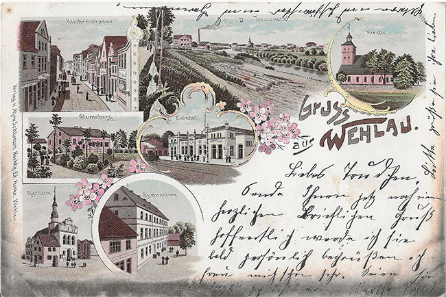
And on the card from Wehlau, placed above, any collector of postcards with views of this wonderful town will recognize among the views printed on it Kirchenstraße, Glumsberg Park, panoramas of the city from Hammerweg, the railway station, the town hall. And even recognize among them the hand of the photographer and publisher from Wehlau Oscar Bittrich. The years of shooting are the end of the nineties of the century before last.
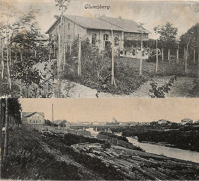
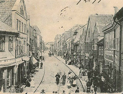
An unknown artist painstakingly re-drew the silhouettes of city landscapes. The composition includes the ancient St. Jacob's Church, the railway station, and the pride of the education system - the city gymnasium... The crowd, the figures of the townspeople - the artist has his own. He even added smoke from the chimney! This is how he saw the world. The collage is decorated with frames and blossoming cherry trees.
Then the printing house got involved. Layer by layer (and there could be twenty-one of them), receiving color prints from the surface of a special lithographic stone, paint was applied to the paper from light to dark tones, giving the picture a spectacular, voluminous and velvety quality.
By the way, the publishing house (and the shop attached to it) of Eduard Holke was located in Wehlau on Pregelstrasse. In the old photo of the town square, this is the corner house in the middle of the frame. Wasn't it in this shop, which by the time the postcard was printed had already passed into the hands of Max Schlamm, where the display case is carefully protected from the scorching sun by awnings, that our card was purchased?

Another remarkable postcard begs to be included in the story... It was published by Otto Böhm, whose printing house was located on the opposite side of the market square, on Kirchenstrasse.
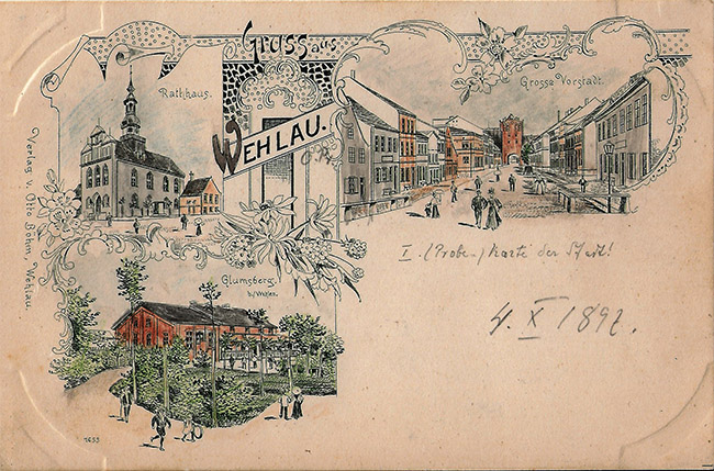
Once again we see the city park Glumsberg copied from a photograph by the same Oskar Bittrich. This popular recreation area was humorously called “Curd Hill” by the residents of Wehlau – that’s the translation. Above is the town hall, depicted from a different angle, and a panorama of the Große Vorstadt street with the Steintor gate, an ancient and also remarkable structure.
According to experienced philocartists from Germany, Manfred Gruhn and Evgeny Dvoretsky, what we have before us may be a pre-production copy of a future lithograph.
The park's signature also puzzled: "Glumsberg b/Wehlen". A typo? The distant Saxon Wehlen has nothing to do with it. In fairness, it should be noted that mistakes in signatures on postcards of those years are not uncommon...
And another souvenir from Wehlau:
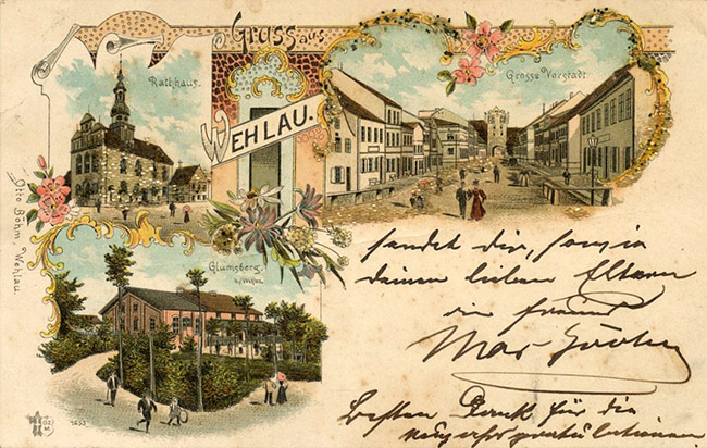
At the turn of the 19th and 20th centuries, Ottmar Zicher printed picture postcards with motifs from many cities both within and outside the German Empire. Between 1898 and 1902, the publishing house published a highly acclaimed series of numbered picture postcards containing over 2,000 motifs. Issue 1653 – Wehlau!
A special category of postcards are those designed in the Art Nouveau style. This is a different aesthetic, simpler, more budget-friendly, but also attractive to the eye. Photos of various objects were framed with intricate hand-drawn frames, sometimes used many times by different publishers. The first such postcards were completely black and white, then colored, embossed, and even gilded frames appeared.
Here we have two more postcards and two more names from the galaxy of Wehlau publishers - Gustav Schmidt and CA Scheffler, and the central card with the town hall has hidden its publisher behind the letters MFK

At the beginning of the 20th century, many more such postcards were issued, when the typographic monochrome world became colorful through the painstaking efforts of hundreds and hundreds of female artists, who had only brushes and stencils in their arsenal, and the image looked somewhat home-made to our modern eyes. But these were the first steps in publishing technologies. For example, a couple of postcards from the German publishing house Mosella from the city of Trier, which is “only” one and a half thousand kilometers from Wehlau.
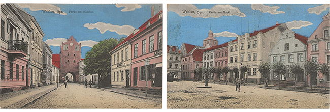
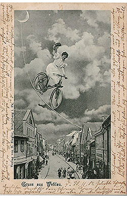
A brief overview of Wehlau's artistic postcards is completed by the Königsberg publisher O. Ziegler. "The sun on the spokes, the blue above the head..." Such century-old collages with a clear picture and creative plot would be the envy of modern Photoshoppers!
